Whew, what a month! April was a whirlwind of activity and I have the lengthy “to do” lists to prove it. May I please lie down and take a nap now that it’s all over?
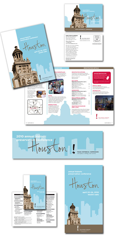
One of the events that kept me hopping was the Annual Historic Preservation Conference which was held in Houston last week. I designed all the marketing collateral for this conference and began working on various promotional materials back in August, so it was rewarding to see everything finally come together.
 I centered the conference’s visual identity around a fresh, contemporary
color combo (brown and robin’s egg blue) and carried this palette throughout the save-the-date postcard, brochure, signage, program, ads, table tents, PowerPoint presentations and other marketing pieces. Sepia-toned photos of historic Houston landmarks were paired with clean, modern line drawings of the city’s skyline to symbolize the relationship between past and present.
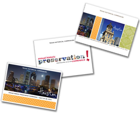
Before selecting this visual identity for the 2010 conference, however, I presented our marketing team with several other design options to choose from. These are a few of my favorites, resurrected from the reject pile for your viewing pleasure.
Aren’t the colors cheery?! Who knew Houston could look so good!
Anyway, yeah, it feels really good to be done! I think I’ll move to the sofa to celebrate…..unfortunately, I can’t nap for too long. May is shaping up to be a pretty exciting month!

1 Trackbacks
[…] a bi-monthly magazine called The Medallion. I also helped maintain the website and designed promotional materials for the Annual Historic Preservation […]